Web Design
Develop your target audience
Solutions
Web Design
Develop your target audience
Marketing Acquisition
Convert more qualified contacts
CRM integration
Generate more business
Précédent
Web Design
Website audit
Identify areas for improvement
Conversion website
Convert your audience
HubSpot CMS theme
Redesign your site quickly
Front-End development
Create a powerful website
Website maintenance
Ensure regular performance
API & Synchronisation
Optimize your functionalities
Précédent
Marketing Acquisition
Inbound Marketing Campaign
Attract opportunities
Copywriting strategies
Captivate your prospects
Marketing Automation
Industrialize your tasks
Email marketing
Get the right message across
SEO strategy
Be #1 on Google
Marketing dashboard
Make the right decisions
Google Ads
Capture your audience
Social media strategy
Control your e-reputation
Précédent
CRM integration
HubSpot CRM integration
Centralize your data
Sales dashboard
Make the right decisions
HubSpot CRM migration
Migrate your data
Sales Automation
Eliminate manual actions
Data segmentation
Target your sales sequences
Aircall telephony installation
Maintain your customer relations
Customer service
Retain your existing customers
CRM maintenance
Keep your CRM data up to date
Agency
Agency
We support business growth through the acquisition of new customers.
HubSpot
HubSpot Expertise
Discover our HubSpot services
HubSpot CRM Platform
Discover HubSpot hubs
Précédent
HubSpot Expertise
Fermer
Que recherchez-vous ?
Suggestions populaires
Inbound Marketing
CRM
HubSpot
Beetween
‘Our collaboration with Make The Grade has been most enjoyable. Thanks to them for their great support’.

Camille Bataille
Content Manager
+30
modules available for WordPress
+10
page templates created
Beetween is a SaaS software publisher focused on recruitment. Beetween's mission is to assist companies in optimizing their recruitment processes, employer branding, and candidate experience.
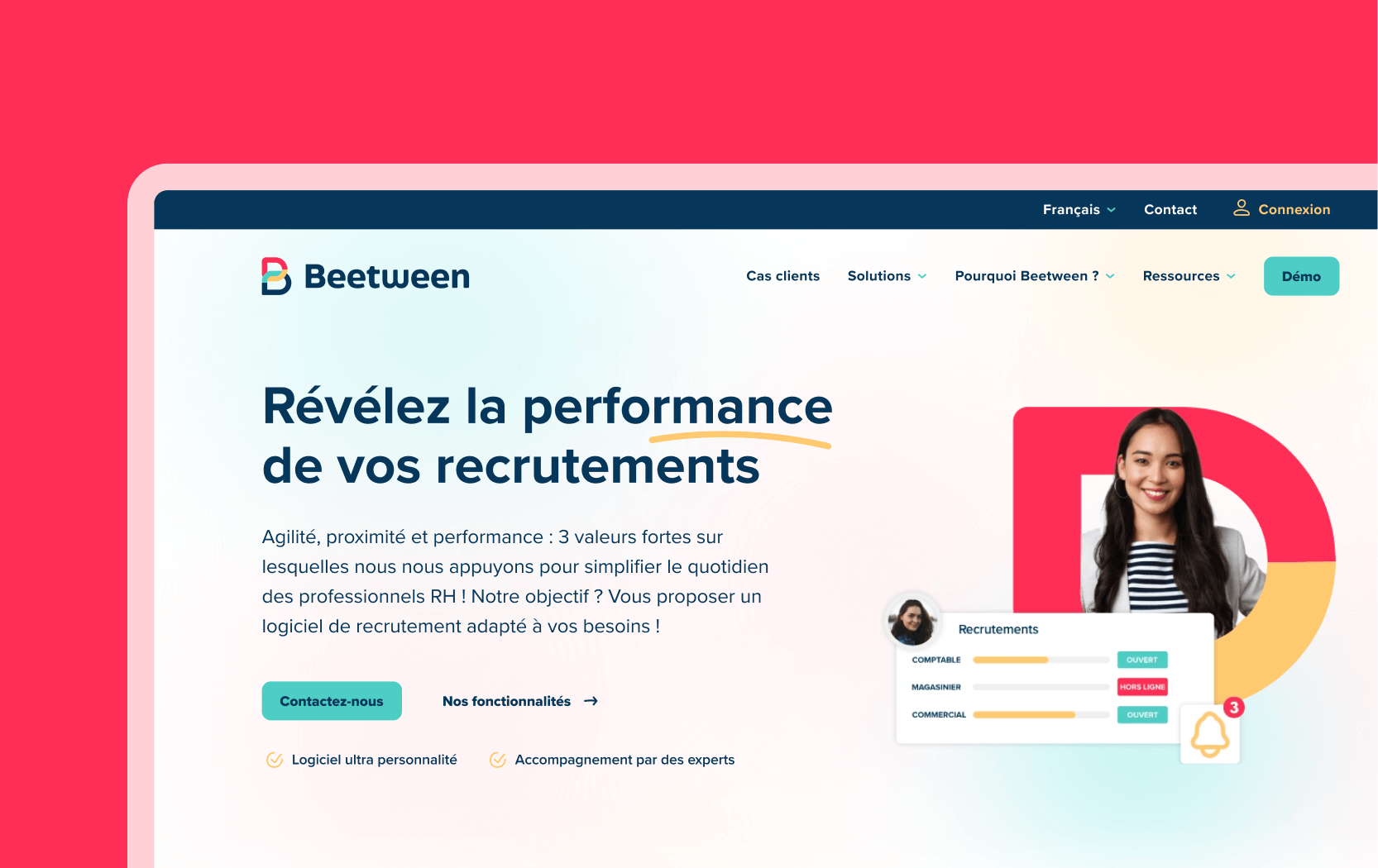
Initially, they enlisted Make the Grade to revamp their visual identity. Pleased with the results, they then decided to redesign their website using the WordPress CMS.
The Beetween teams wanted to update the style and colors of their graphic charter, which they felt lacked character. They aimed for a more vibrant universe that also represents the connection they create between candidates and recruiters. They were keen to retain the letter "B" in their logo.
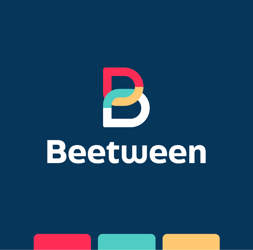

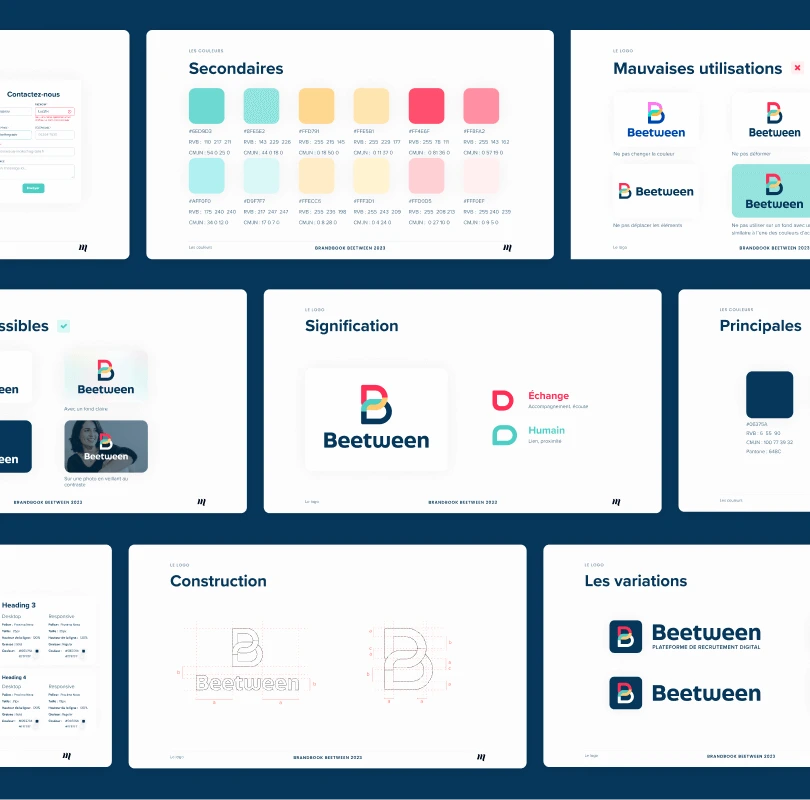
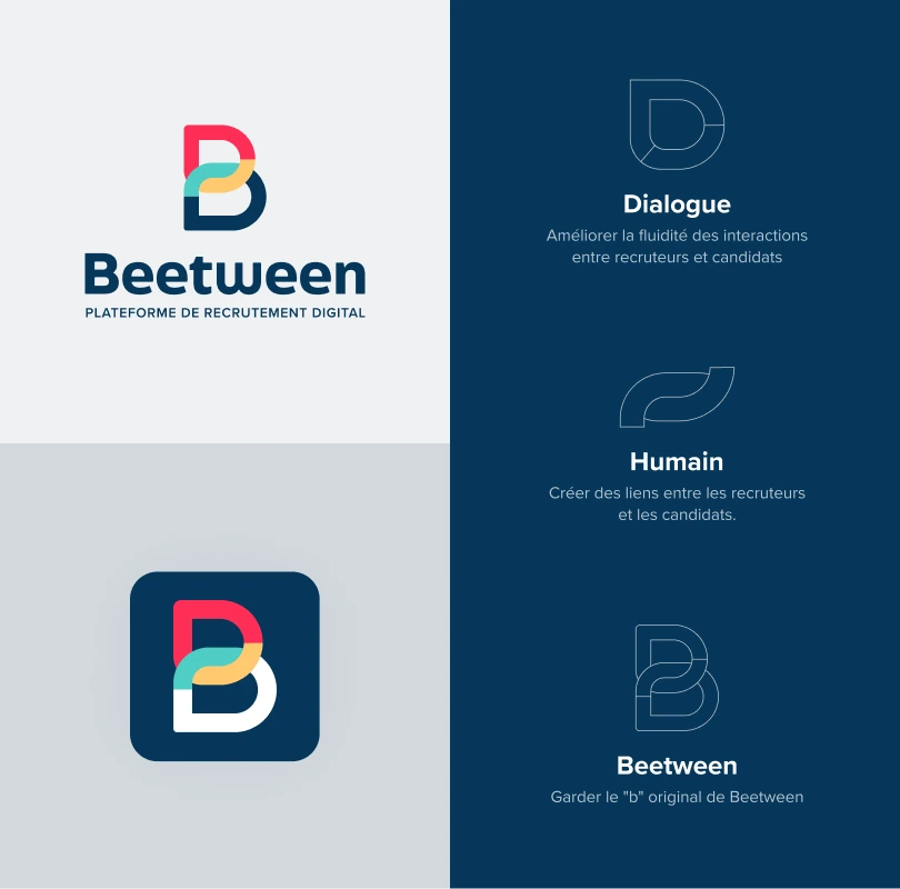
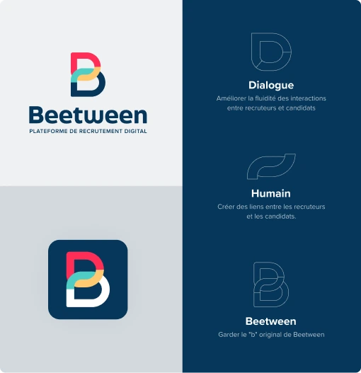
To meet the brief, a logo containing 4 colors was designed. Two blues so as not to stray radically from their initial color, a raspberry and a yellow to bring warmth and energize the logo.
As for the shape, the "B" is always clearly visible and is made up of 2 bubbles to represent communication. The 2 bubbles are arranged to create a chain that symbolizes the link between candidates and recruiters.
A color palette is used for the logo.
A more neutral color palette was also proposed to anticipate the creation of the website.
Once the graphic charter had been validated, our designer set to work on the ergonomic and graphic mock-ups. Historically, the Beetween site contained numerous illustrations and royalty-free photos.
In order to preserve the original look and feel of the Beetween site, we decided to redesign the site as well.
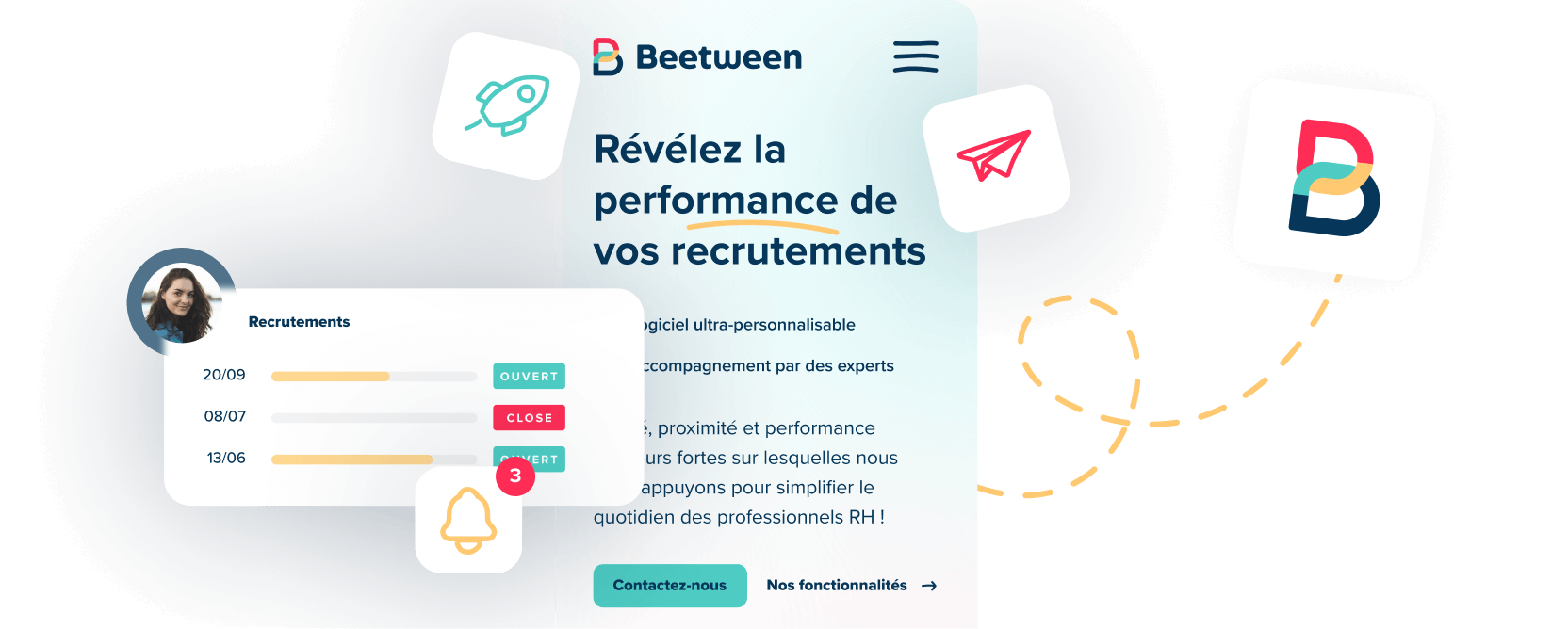
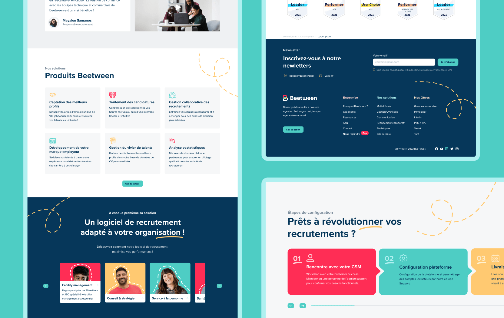
In order to preserve the spirit of the logo, we suggested they add more human elements for the communication and link side. The photos of the people were thus integrated into the communication bubbles used for the logo.
To represent the path of the company, we asked them to add a little more human touch.
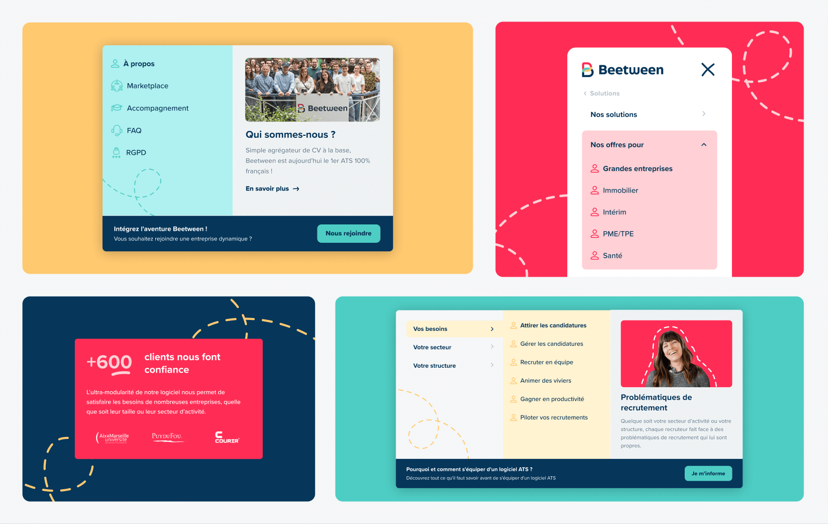
To represent the professional path a person follows in the course of their career, we suggested adding dotted lines on several modules.
Finally, for the site's pictograms, we proposed a style that looks hand-drawn. The aim was to represent the "made-to-measure recruitment" spirit and move away from the automation and industrialization side.
Finally, for the site's pictograms, we proposed a style that appeared to be hand-drawn.
The results of the redesign of the beetween.fr site are as follows:

Your needs
Do you have a project?
We test, we iterate and we're constantly on the lookout. There's no magic formula for exceeding your B2B growth targets, just method, challenge and know-how.
Contact one of our experts

