Web Design
Develop your target audience
Solutions
Web Design
Develop your target audience
Marketing Acquisition
Convert more qualified contacts
CRM integration
Generate more business
Précédent
Web Design
Website audit
Identify areas for improvement
Conversion website
Convert your audience
HubSpot CMS theme
Redesign your site quickly
Front-End development
Create a powerful website
Website maintenance
Ensure regular performance
API & Synchronisation
Optimize your functionalities
Précédent
Marketing Acquisition
Inbound Marketing Campaign
Attract opportunities
Copywriting strategies
Captivate your prospects
Marketing Automation
Industrialize your tasks
Email marketing
Get the right message across
SEO strategy
Be #1 on Google
Marketing dashboard
Make the right decisions
Google Ads
Capture your audience
Social media strategy
Control your e-reputation
Précédent
CRM integration
HubSpot CRM integration
Centralize your data
Sales dashboard
Make the right decisions
HubSpot CRM migration
Migrate your data
Sales Automation
Eliminate manual actions
Data segmentation
Target your sales sequences
Aircall telephony installation
Maintain your customer relations
Customer service
Retain your existing customers
CRM maintenance
Keep your CRM data up to date
Agency
Agency
We support business growth through the acquisition of new customers.
HubSpot
HubSpot Expertise
Discover our HubSpot services
HubSpot CRM Platform
Discover HubSpot hubs
Précédent
HubSpot Expertise
Fermer
Que recherchez-vous ?
Suggestions populaires
Inbound Marketing
CRM
HubSpot
Aptic

‘A project just the way we like them. A lot of freedom to create this new graphic universe, a well thought-out and designed site, satisfied customers.’

Marie Giron
Lead Designer, Make the Grade
26
modules developed on the HubSpot CMS
30
pictograms produced
Aptic is a consulting firm specializing in recruitment and human resources. Aptic offers a tailored service that leverages the industry and sector expertise of its consultants.
They enlisted Make the grade to revamp their visual identity and website.
Their initial logo led to misunderstandings, and they wanted a clear representation of their business, conveying seriousness, credibility, commitment, personalization, and attentiveness.
The brief emphasized the need to create a serious identity while highlighting closeness with clients and the quality of service provided.
Regarding the graphic charter, Padok historically used purple as the primary color and blue and green as secondary colors. The teams wanted to retain only purple as the main color.
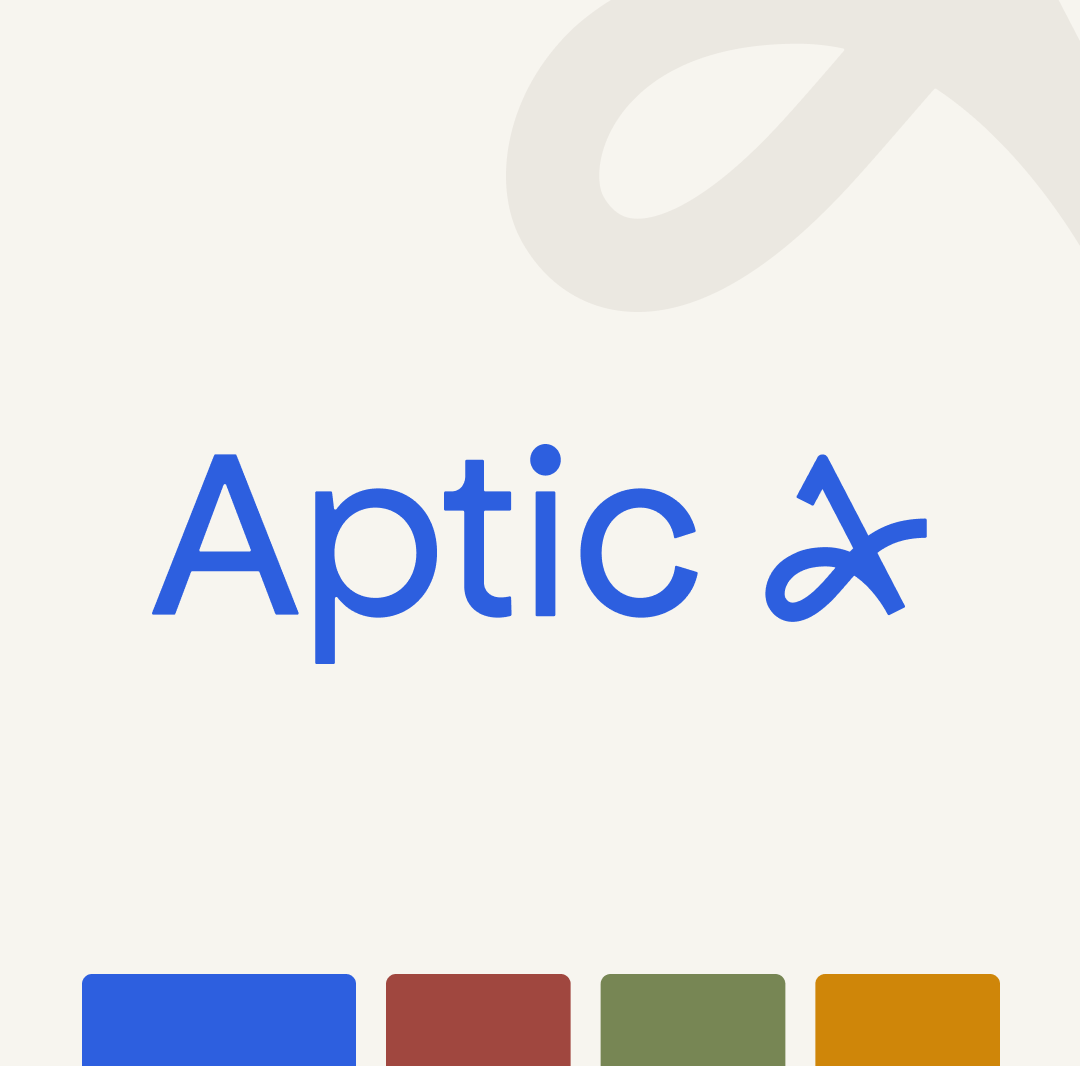

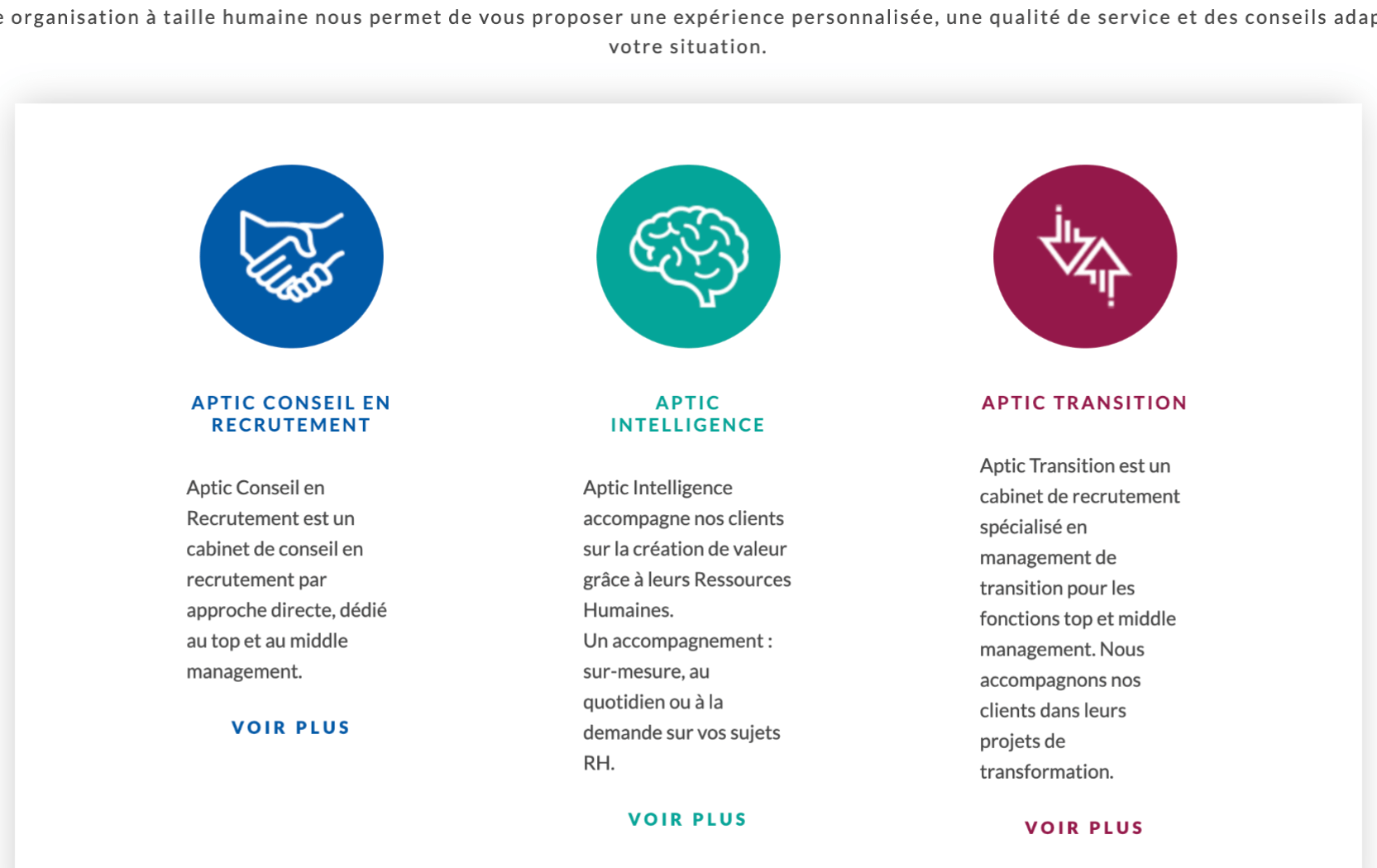
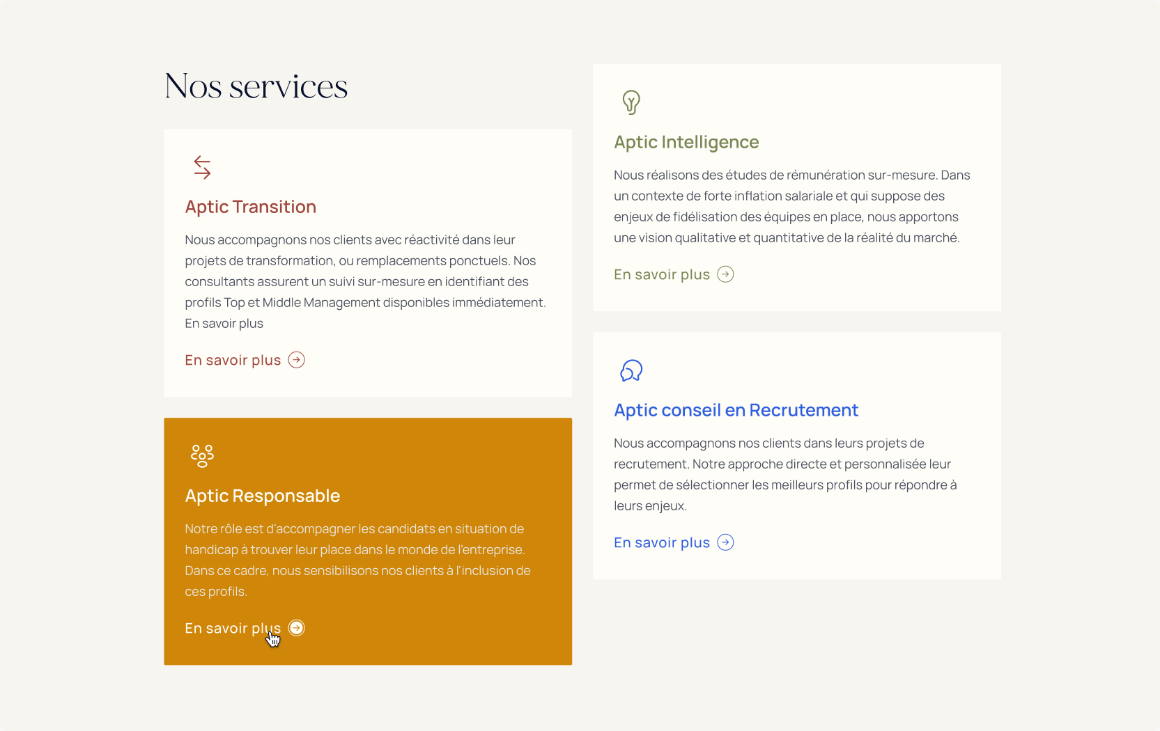
Avant
Après
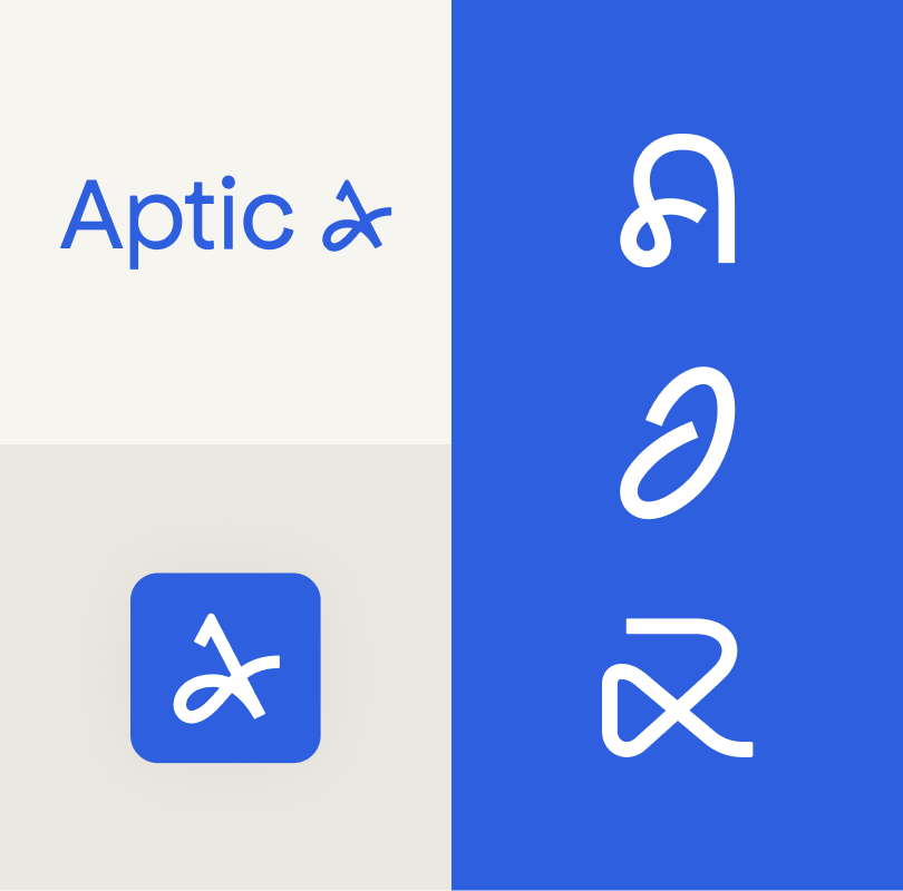

The colors had to reflect elegance without being too bright, with a preference for soft hues to bring warmth and humanity. We chose blue as the main color, accompanied by beige to bring a warm, human feel. We also added three colors to distinguish the different departments: burgundy, olive green, ochre.
With regard to the logo, the solution adopted was to design a stylized handwritten signature, representing an "A", such as that affixed to the end of an employment contract. This approach symbolizes the company's ultimate goal of turning contracts into permanent contracts, reinforcing credibility and the ability to achieve set objectives.
.The use of logo overprints adds elegance and brings to mind luxury brands to recall the premium and quality side.
The visual identity was declined with different shades for each service, allowing for distinction while remaining harmonious throughout
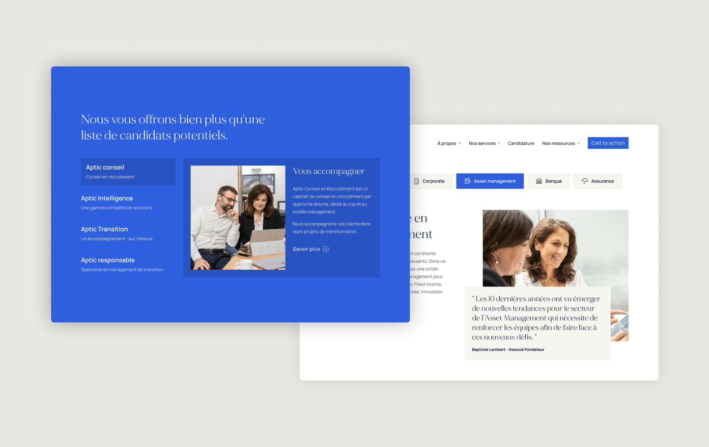
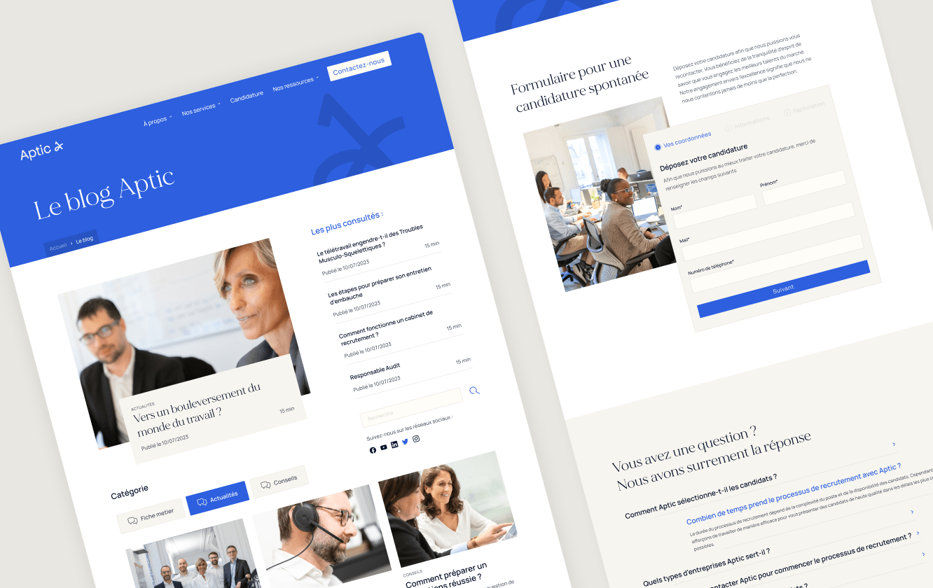
The website was redesigned with elegance and clarity. For the titles, we chose a modern Serif typography that brings elegance to the whole. We alternated sections on beige and colored backgrounds to add dynamism. Overprinted elements were added in places to reinforce the visual identity in place.
We recommended that Aptic integrate pictograms to reinforce the impact of certain site elements. For the design, we relied on the aesthetics of the logo and handwritten signature, drawing them with a single stroke, in other words, without ever lifting the pencil.
The site was initially intended to be a "one-stop-shop" for the company.
The site was initially devoid of human presence. So we suggested they add photos of their team members to reinforce the serious, human image of their company. So they organized a photo shoot with employees to provide us with material. We then embedded these photos in various "A "s we created in the same style as the logo to reinforce the visual universe.
The results of the redesign of the visual identity and the cabinet-aptic.com site are as follows:
Score a sur Eco Index

Max. 100
Min. 0
a
b
c
d
e
f
g

Your needs
Do you have a project?
We test, we iterate and we're constantly on the lookout. There's no magic formula for exceeding your B2B growth targets, just method, challenge and know-how.
Contact one of our experts

